
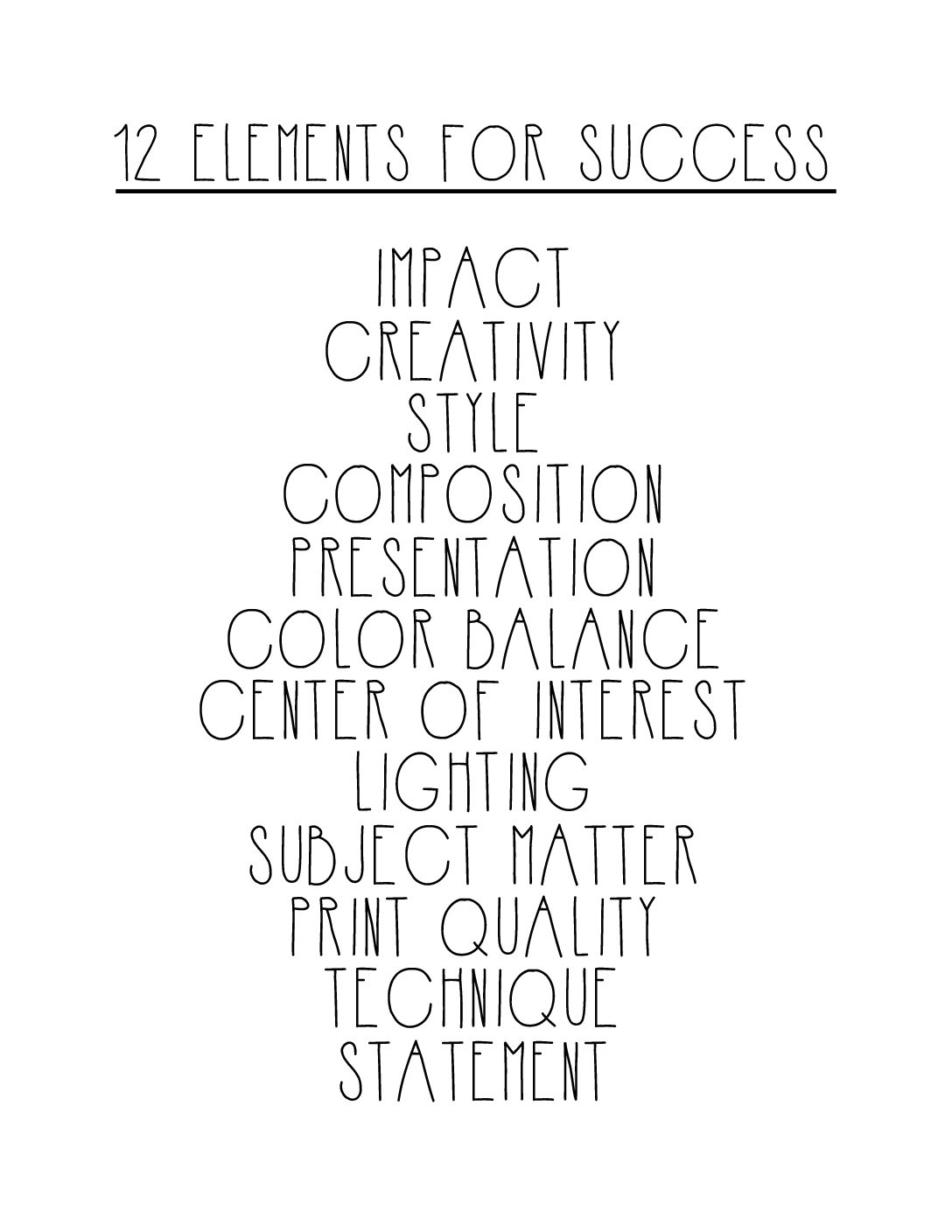
THE 12 ELEMENTS OF AN AWARD-WINNING IMAGE
For many years I was the photography competition director for the Professional Photographers of the Greater Bay Area organization, a local chapter of The Professional Photographers of America. While I held that position, I was able to learn a great deal about what makes an award-winning image merit worthy and the criteria judges use to determine an award winning image vs. a ‘thanks for participating’ image. Calling an image or art piece ‘merit worthy’ usually means you are discussing an image in a competition, but the guiding principles of judging an image can be used with nearly any visual art medium to help in determining its value artistically. The question I was undoubtedly asked the most, in terms of judging, was ‘how can I compare a studio lit portrait to a technical architecture shot to a commercial product advertisement to any other type of image you could think of?’ The answer is by utilizing these 12 elements to determine each images worth in and of itself. In art, you are only ever really in competition with yourself.
So let’s go over the qualities that take an image from good to great.
Impact
Just like an asteroid impacting earth an image should hit you the moment you see it. Are you drawn to it? Are you bored by it? Outraged? Indifferent? Does it make you feel like laughing out loud, or crying out in outrage? Do you feel captivated enough to keep looking and delve deeper into the image. Impact is your gut feeling to an image the moment you first see it. It’s the difference between “Whoa! That is an incredible image!” and “Blah, next!”.
Creativity
Creativity is one of those elements which is simultaneously easy and difficult to define. It is literally defined as “Using imagination or conceptualizing original ideas and implementing them in a unique and pleasing way.” The reason that, in my personal opinion, creativity is more difficult to nail down is because photography is inherently a creative medium. However, that doesn’t necessarily mean every image presented is a creative one. For an image to be truly creative in my opinion, it must be presenting at least some element which I have never seen before or something that pushed the boundaries of my imagination. The content must be fresh and original or have something to say in a creative way.
Style
Most of the time, if you are discussing style (in terms of photography) it’s people trying to define what the vibe of their portfolio as a whole is. What you can expect to see if you look through their book. However, when discussing style in terms of a particular image we focus more on genre, content, and/or types of editing. For instance it could refer to genres like; glamour, surreal, abstract, traditional, graphic architecture, or still life. Or it could be referring to characteristics such as; HDR, black and white, or infrared. Style really focuses on the elements that give an image it’s distinctive appearance.
Composition
Composition is critical to creating a strong image. Where in the frame is the main element presented and how do the other elements interact with it. By utilizing good composition the image maker can cue the viewer where to look and how their eyes should move over an image. There are many compositional formulas makers can utilize when creating their imagery such as: rule of thirds, the golden ratio, golden triangles and spirals, balance, patterns, symmetry. etc. (I will have to delve deeper into these in a future blog post) Image makers can utilize these ‘rules’ to enhance the impact of their images.
Presentation
These are the final touches on how you actually view an image. Is it a physical print or a digital image? Did the maker utilize any type of mats or borders? These final touches should enhance the completed look, not distract from it. In my personal opinion, less is always more here. I always tend to favor clean and polished presentations.
Color Balance
The reproduction of colors in a color print, alterable during image editing or darkroom color printing. It’s the harmony or tension between the colors of the image. A great example of this would be using warm vs. cool tones to create tension. Think back to the color wheel and how those colors interact with one another and how you can utilize them to enhance your image. I also believe white balance falls within the scope of color balance. Making sure your colors are pleasing and accurate are key to a successful image.
Center of Interest
This is the main element or elements that the maker wants you to stop and take in. It is usually very obvious what you should be focusing on in an image. Alternatively, there are sometimes images with no center of interest where the entire scene acts as one cohesive piece of interest.
Lighting
Looking at how the image maker used natural, available or created light to enhance their subject. In any instance the maker should have a strong understanding of how light interacts with their subject, including different lighting setups (short lighting, broad lighting, butterfly, etc.) and should utilize or implement these different light setups to enhance it.
Subject Matter
What is the point of the image and what is the artist trying to convey? The subject matter should be relevant to the story being told by the image. Why are they even showing us this image in the first place?
Print/Image Quality
This is the technical competence of an image. Is it properly exposed? Is it sharp or soft? Is the color and white balance correct? Has the retouching enhanced the image? If the image is printed, how is the print quality? If it is a digital image, does it look pixilated or low quality? These are just a few of the elements to keep in mind when considering the technical quality of an image.
Technique
What was the approach the maker took to create the final image. The mastery of combining lighting, posing, lens choice, presentation, among many others – making them all work harmoniously together to create one solid final image.
Statement
“A picture is worth a thousand words.” Well, what’s this picture saying? What is the story being told and is it worth listening to? Art is beautiful in that what we can all take away something different from the same piece of artwork – it’s about seeing things that resonate with us in the work.
So, there you go. Do you agree with these 12 elements? Are there any additional ones you think we missed? If you are ever wondering about an image and its artistic merit just run through this list and try to be objective, and as always, feel free to send me images for an honest and constructive image critique!
Thanks for reading!